Typeface System for
Sephora
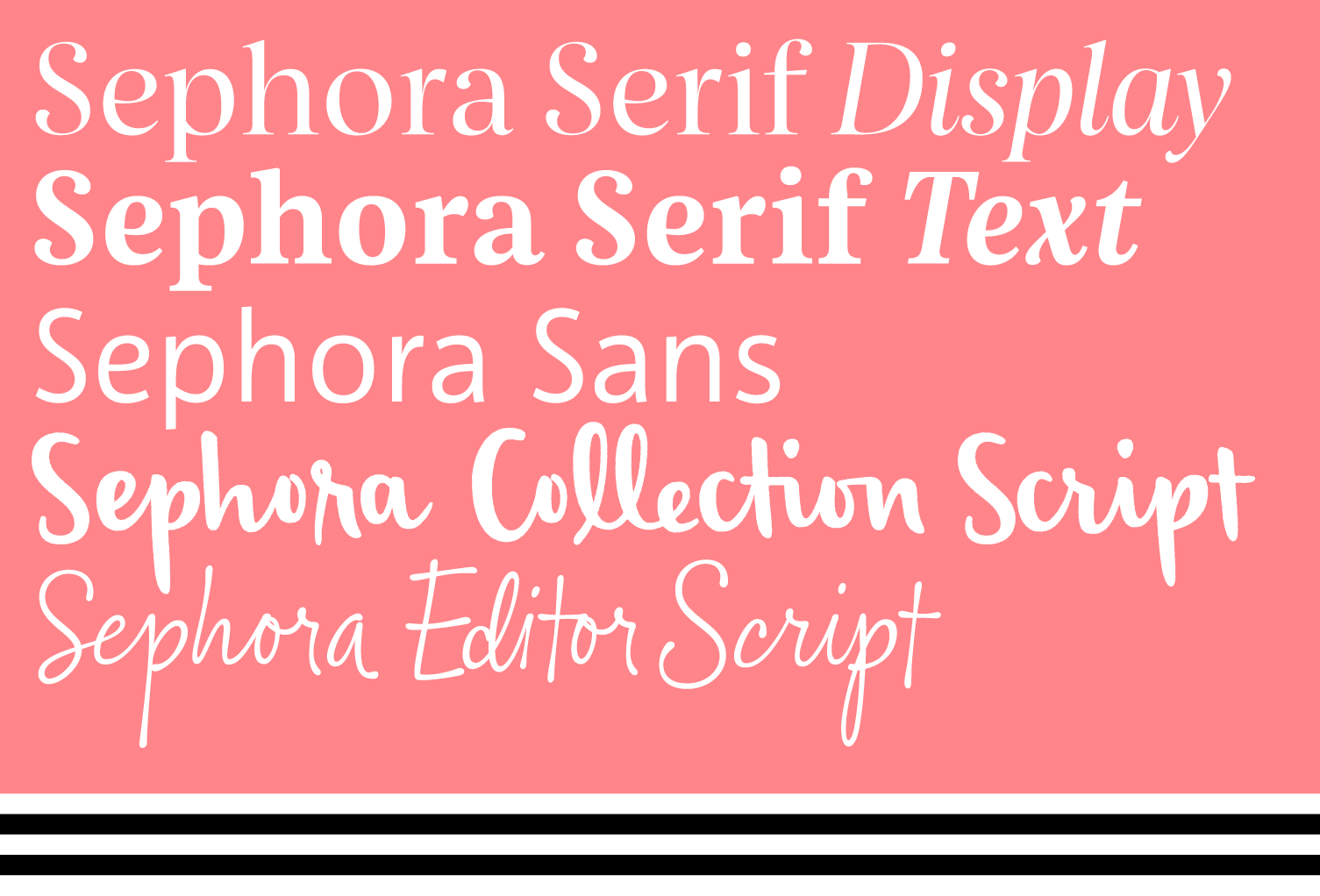
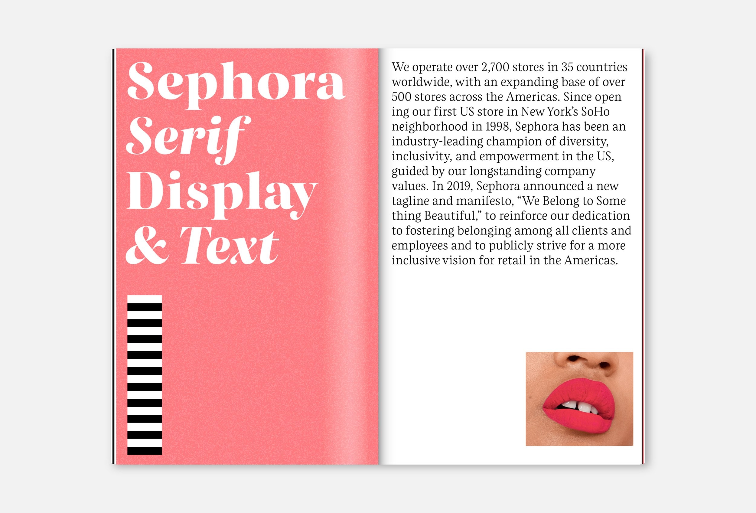
The world’s largest beauty retailer, Sephora, uses their custom typeface system for their global branding on their printed materials, their shop fronts, their website and their mobile apps. In collaboration with New York-based agency Mucca, the team at Schriftlabor created a typeface superfamily consisting of two serif and one sans-serif family, plus two unique handwriting fonts.
The client brief was clear: the new typefaces had to be recognisable as part of the cosmetics and beauty genre, yet different enough to stand out in the industry, and lend Sephora a distinct typographic voice. A typographic analysis of the industry yielded an overuse of high-contrast Didot variants, coupled with sans-serifs such as Gotham or Helvetica.
In the process, we worked in some special treats that would keep the legibility and overall appearance of the typefaces, but make them instantly recognisable. The shape of the endings was settled to be a floral spiral, a subtle, yet distinct hybrid between a strict serif and a completely round ball ending. Or the lowercase e, for example, always has an italic shape, even in the uprights, while the w sports an open second counter.
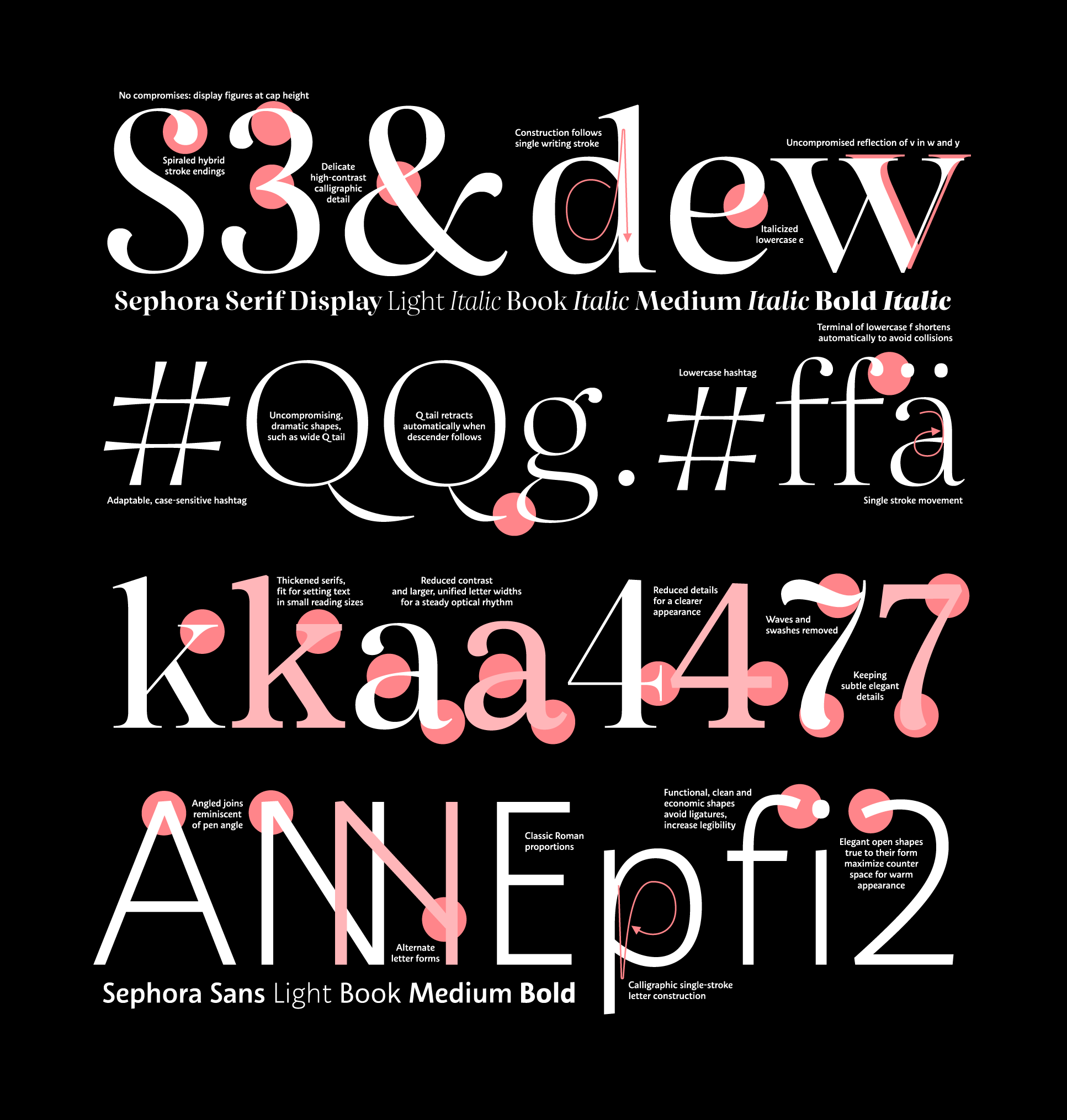
As a follow-up, we were commissioned to add a text version to the serif typeface. This meant simplifying some shapes that were great in the display typeface, but too extravagant for longer reading. It also meant increasing the spacing to and reducing stroke contrast, and restructuring shapes where necessary. The changes are necessary to give a line of text a calm and even rhythm, to facilitate and speed up the actual reading process, and make the fonts fit for difficult situations such as typesetting across photos. Throughout all these changes, the familiarity with the Serif Display had to be maintained. Schriftlabor designer Igor Labudovic was responsible for optimising Sephora Serif Text for maximum legibility.
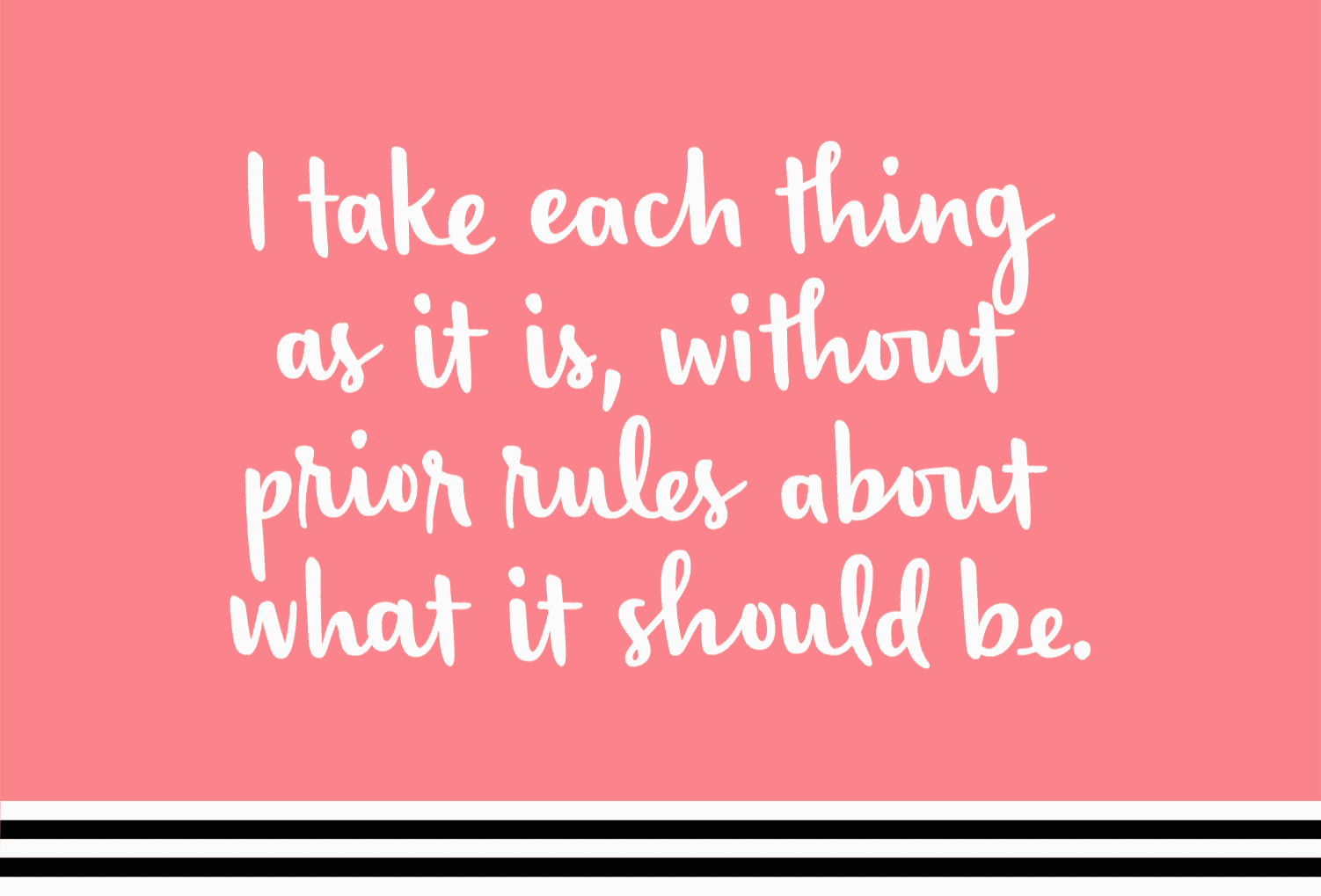
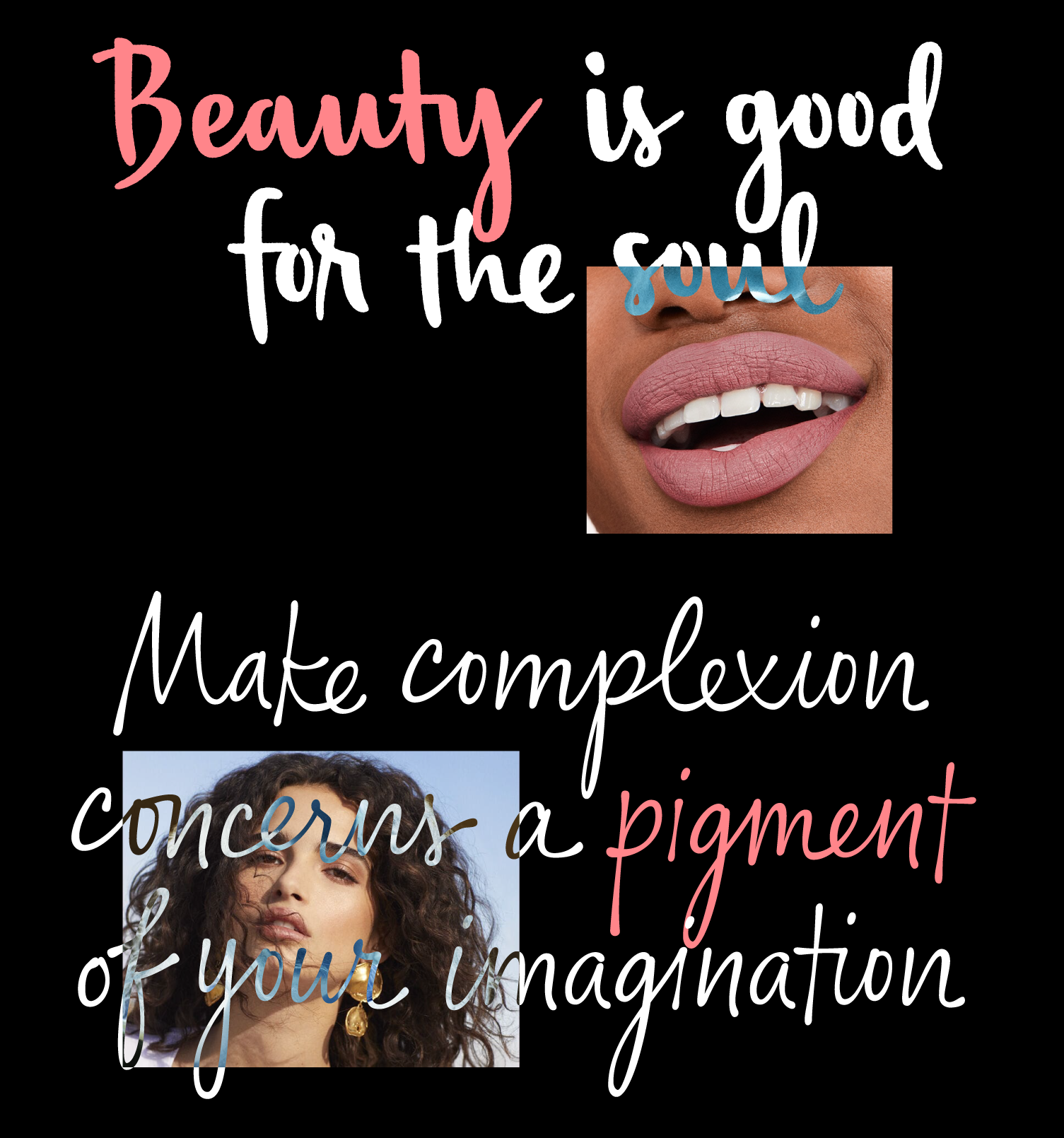
Two script typefaces were commissioned: Sephora Script Editor, conveying the style of a Beauty Editor giving you professional and personal advice on a sticky note, and Sephora Script Collection, with a young, bold and energetic look, as if written with a lipstick on a mirror, intended for use with the Sephora Collection series of products, hence the name. The two handwritings are siblings as if written by the same person, but under different circumstances and with different writing materials.
We asked many people to write a few words by hand until we settled for the handwriting of Sara Frisk, a young woman from Chicago. Countless samples from Sara were digitised by Schriftlabor designers Chiara Mattersdorfer and Franziska Hubmann, and custom software was written to produce outline variations from the skeleton strokes in the early iterations. At one point, however, Franziska expanded strokes to outlines, so she could take full control of the letter shapes and do the fine-tuning necessary for the handwritten details. In parallel, Chiara, Franziska and Rainer developed heavy-weight OpenType substitutions that kick in automatically while typing. Again, specialised software was written to control the substitutions for the approximately 1400 glyphs in each font.
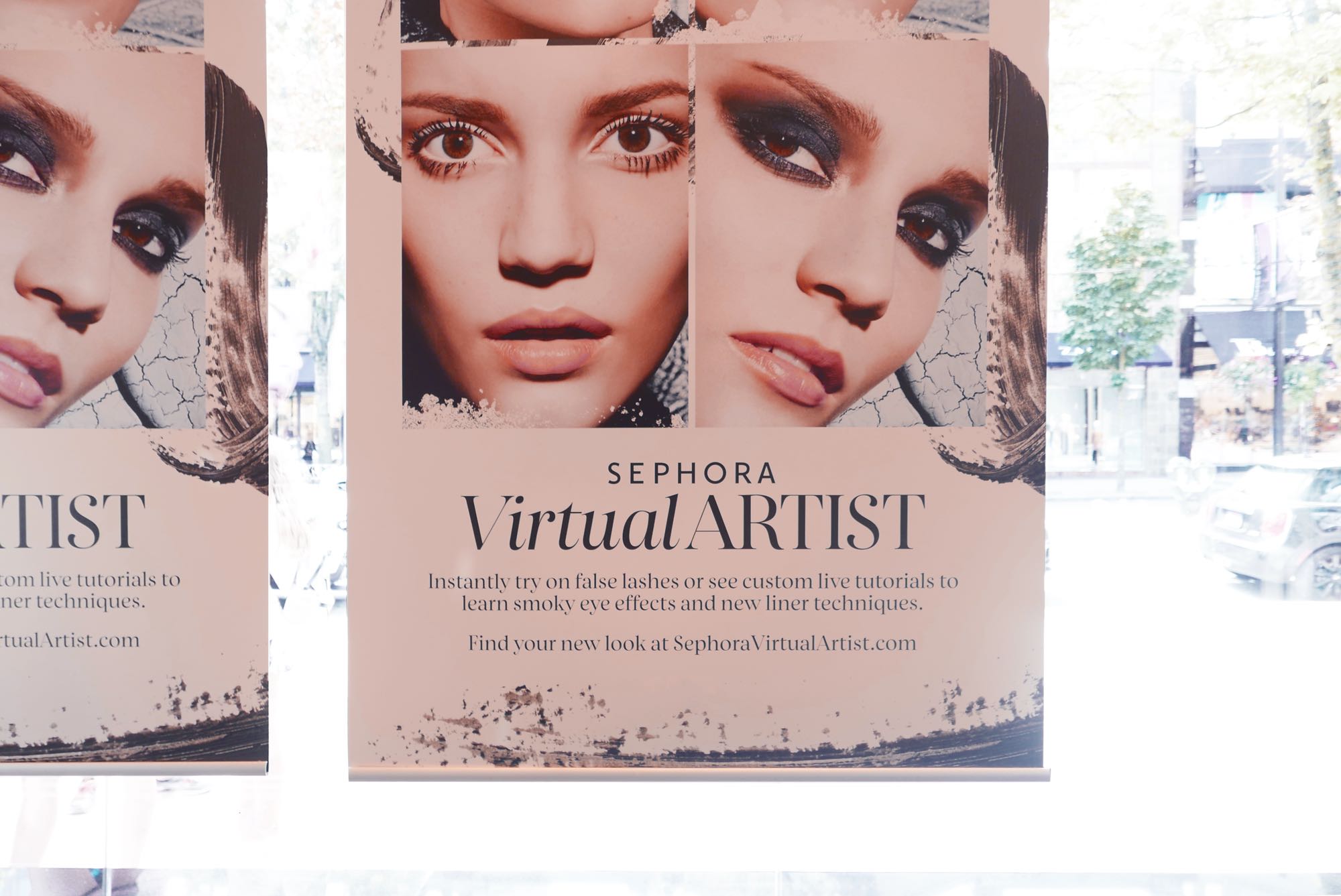
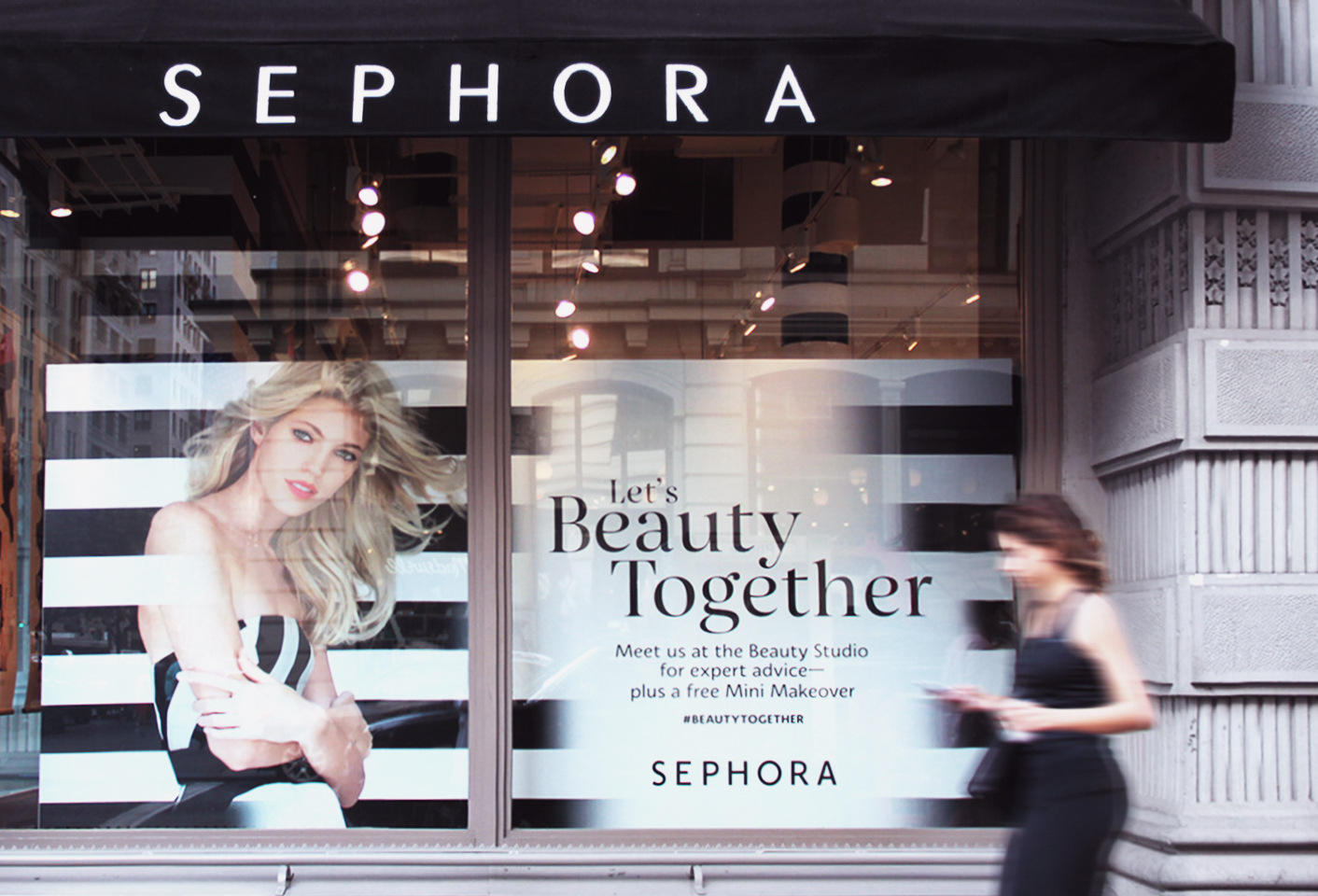
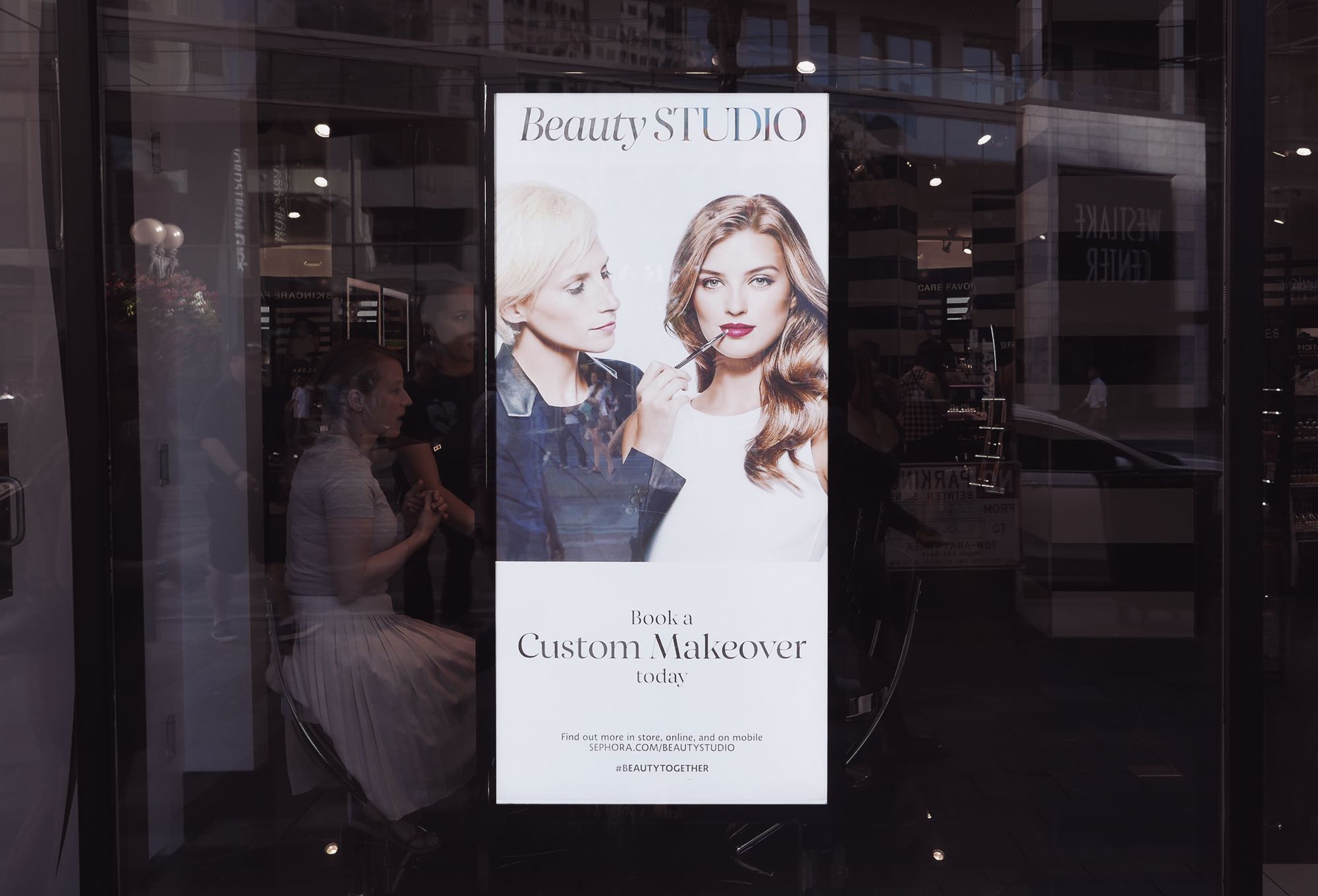
We started seeing the Sephora typefaces in use on the website and in stores, also on leaflets and folders. While there is no Sephora in Vienna, we do go abroad once in a while, and whenever we see a Sephora store, we cannot resist taking a peek inside now.